Useful Visualizations
Three key charts that highlight different aspects of your recovery, built on rolling analysis, plus how to push further with segmentation and additional metrics.
Once you’re calculating recovery rate and other metrics on rolling time periods (let’s assume 30 day rolling periods for this lesson), you’re ready to start visualizing your performance data.
We’ve found 3 key visualizations to be useful, each adding its own context for analysis:
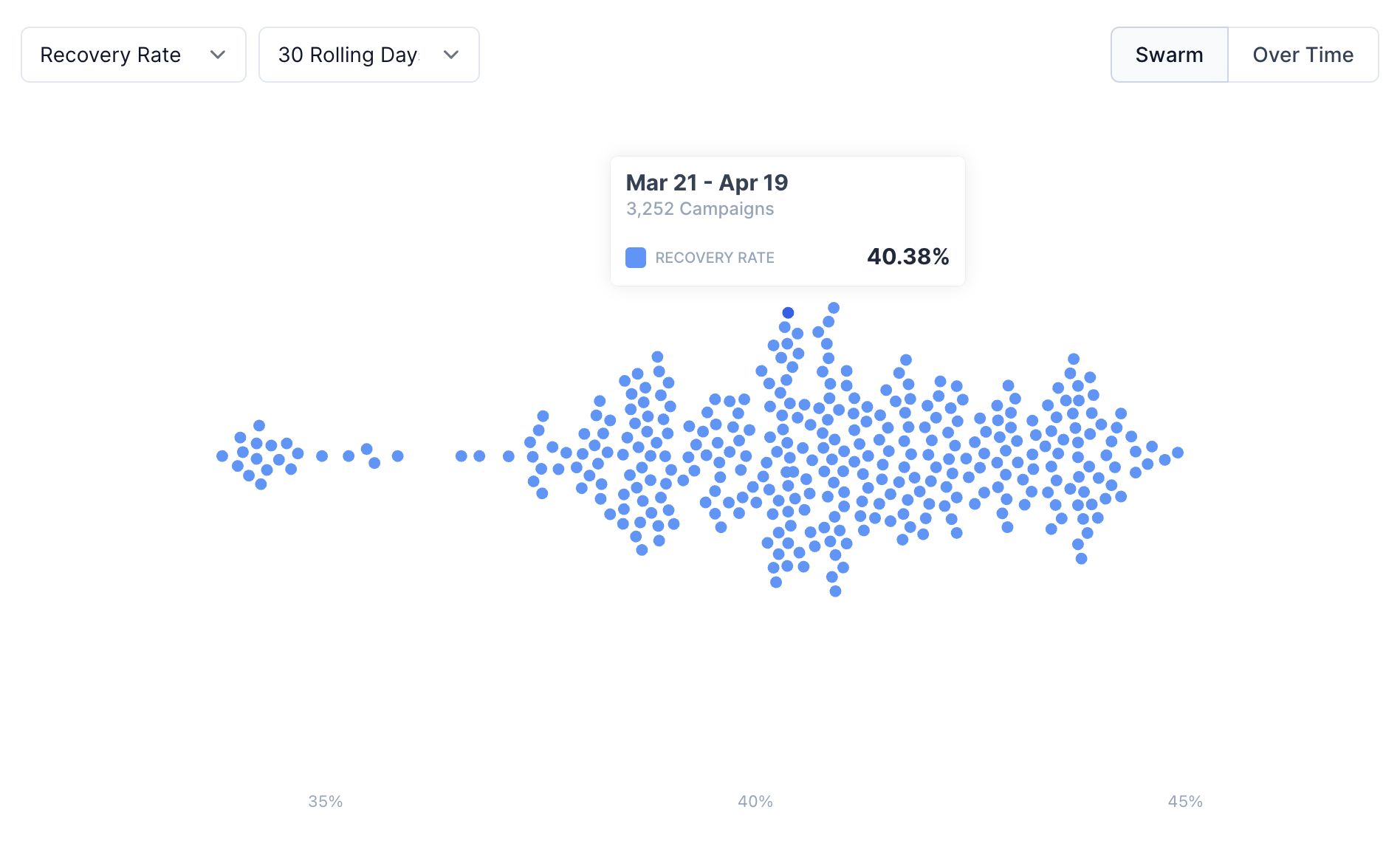
1. Swarm or Histogram Chart
A swarm plot or histogram is valuable for showing the distribution of recovery rates across 30-day rolling time periods. These visualizations help you understand your typical recovery range, and identify any outliers.
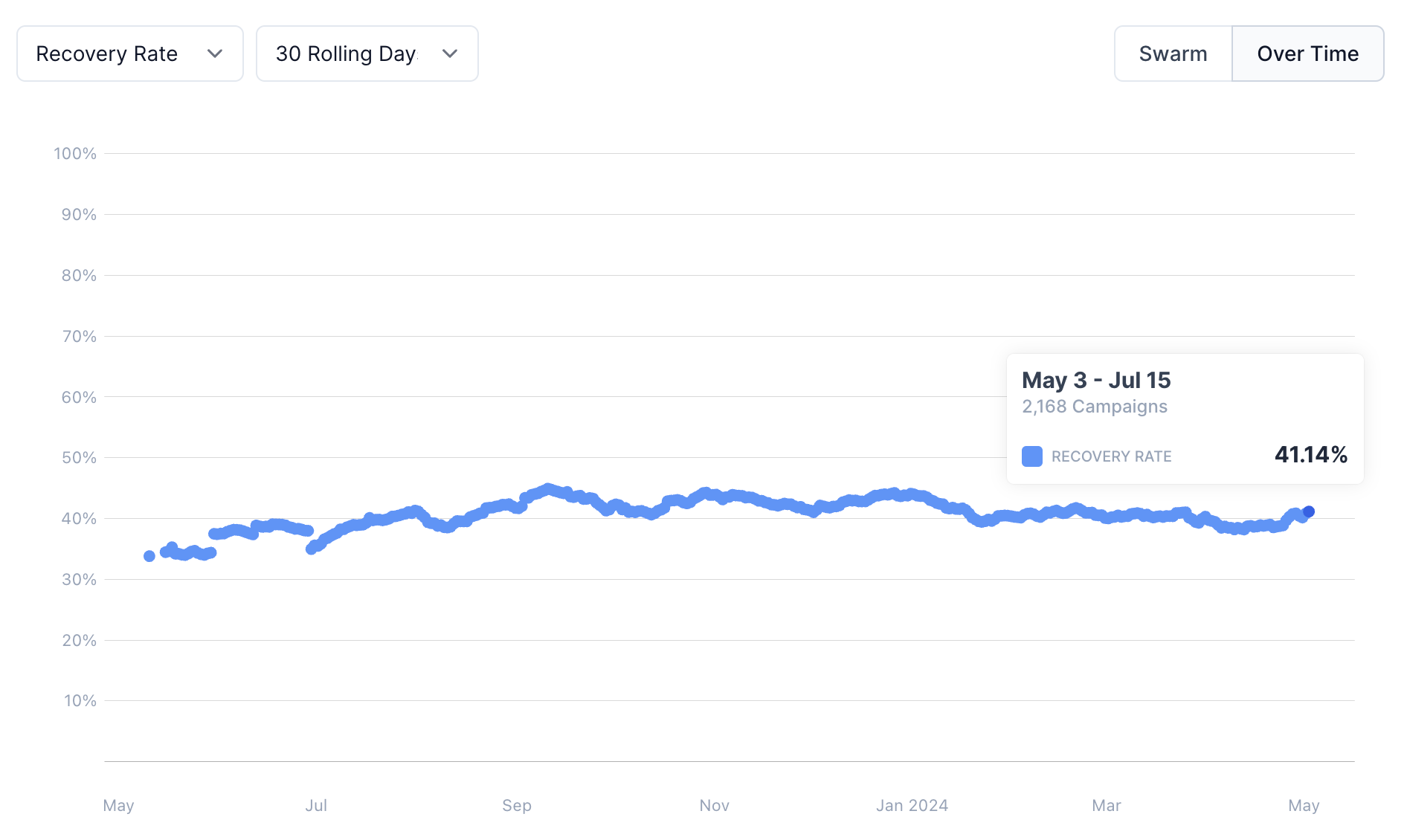
2. Over Time Chart
A chronological, or over time, view shows your rolling recovery rate over time, providing a timeline-based look at your performance. This view is essential for spotting trends, seasonality, or any anomalies that may indicate problems or opportunities in your recovery process. It’s also critical for comparing dunning tools, and understanding the trend that was happening prior to switching tools, since attribution can be difficult (what was going to happen anyway based on natural variance?).
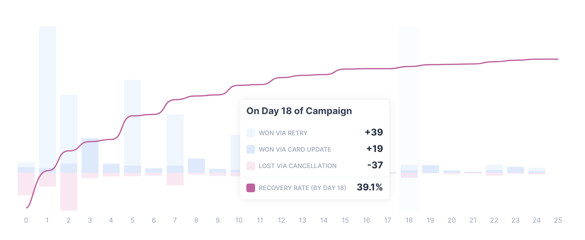
3. Cumulative Chart
A cumulative view shows how recovery rates grow over time by aligning all recovery efforts and tracking progress across a consistent time frame, such as day 1, day 2, etc. This approach looks at the percentage of customers recovered by a certain number of days following the first failed payment attempt, making it easier to understand the full lifecycle of a recovery effort.
This view highlights the diminishing returns of recovery efforts, and can shine a spotlight on how much certain strategies are yielding in terms of results. It’s an advanced chart that drives much of our strategy, and can be difficult to recreate with your own data, unfortunately.
Next Level: Add Metrics and Segmentation
Taking this a couple steps further, these charts become extra valuable when you:
- Add Metrics: Don’t just look at recovery rate, also chart recovery rate via retries alone, or cancellation rate, to understand other aspects of your process.
- Use Segmentation: Zoom into specific customer cohorts, or decline types, to evaluate performance while controlling for natural variance.
Example: Use segmentation to look specifically at insufficient funds, and zoom into retry success specifically, to compare retry strategies.
What’s Next?
Everything we’ve covered in this Passive Churn Course is built into Churn Buster’s reporting — a 1-click connection surfaces the same analyses on your own data with Churn Buster Dunning. We’re also happy to conduct this analysis for you, or answer any questions you have about passive churn. Learn More.