
Data & Testing
How to read your recovery data, what each chart answers, and how to test a change without fooling yourself.
Jump to
- Every account has a recovery ceiling
- How Churn Buster calculates your recovery rate
- What each chart answers, and what it doesn't
- How to test a change without fooling yourself
- A/B testing your dunning campaign
- Export your campaign data
- Ask questions about your data with the Churn Buster MCP
- Where to go next
Every account has a recovery ceiling
"Is my recovery rate good?" has no answer on its own. The same rate can be excellent for one business and mediocre for another, because every business is unique.
What sets the limit is the math of what's recoverable from your own failures. Whether it's due to bad contact info or customers who have no intention to renew, some percentage of your subscribers won't be moved by better software or more emails. That's your recovery ceiling.
So the question isn't where your rate sits against other companies. It's how much room is left between your rate and your own ceiling. Some accounts sit close to theirs, and the work is holding the line as their customer mix shifts. Some are a long way off, and we need to close the gap.
Optimization gets harder the closer you are to your ceiling. When changes stop producing gains, that's usually the ceiling showing up in the data rather than a failure of effort or approach.
How Churn Buster calculates your recovery rate
The formula, and what sits in the denominator
Your recovery rate is the share of recovery campaigns that ended in a successful payment.
A campaign starts when a subscription payment fails, and it ends in exactly one of four states. Card update and successful retry are recoveries. Active cancellation and passive churn are losses. All four sit in the same denominator.
Every campaign that started on the same calendar date. We assign a campaign to its start date, and it stays there however long it takes to resolve. Cohorts are how we make sure a published rate covers a complete set of outcomes instead of whichever ones happened to land first.
One state does leave the cohort. If you or the customer cancelled the underlying order rather than the subscription, through a skip, a pause, or a delay, the charge that started the campaign no longer exists. We void those campaigns, and they count as neither a recovery nor a loss.
Dollar-weighted and count-based rates answer different questions
Dollar-weighted divides dollars recovered by dollars at risk. Count-based divides recovered campaigns by total campaigns. Same outcomes underneath, weighted differently.
Dollar-weighted is the better read for a business decision, because it tells you what the failures were worth. Count-based is the better read for analysis, because it takes price out of the picture. A month where a few high-value subscriptions failed looks dramatic in dollars and ordinary in counts, and only one of those is telling you something about your dunning.
The dashboard has a toggle between the two. When you compare two periods, use the same basis for both.
Active cancellations stay in the denominator
When a customer cancels while their recovery campaign is running, that campaign counts as a loss and stays in your denominator.
Removing mid-campaign cancelations will falsely inflate recovery rate. In fact, a cancellation spike would increase the effect, shrinking the denominator and often lifting recovery rate by double digits. We keep them because the recovery experience itself can cause the cancel. Billing confusion, friction in the card-update flow, emails that read like a robot wrote them, retries timed badly. Further, removing cancellations from the denominator hides the ball with important business data, manipulating outcomes after a measured campaign has already begun.
Active churn is a customer who tells you they're leaving. Passive churn is a customer whose payment fails and who never responds, so they stop without ever saying so. Dunning exists for passive churn, but active cancellations happen inside recovery campaigns too, which is why both show up in your dunning data.
Recovery credit doesn't depend on which system landed the payment
A successful payment counts the same whether a Churn Buster retry landed it, your platform's own retry landed it, or the customer updated their card on their own.
Measuring only what we triggered would sound more rigorous, but would actually be worse. It rewards gaming outcomes, retrying more frequently to beat your platform to a successful charge, claiming credit for recoveries that were going to happen anyway. Your recovery rate measures what happened to your customers, not what we can take credit for, and it's why we charge a flat fee instead of a share of recovered revenue.
Where a specific recovery came from is still traceable on most platforms. Your exports carry each campaign's full history, sometimes alongside your platform or processor data, so you can follow a single payment when you need to.
Splitting recoveries into card updates and retries depends on your platform sending a card-update event. Not every platform sends one, so those accounts see recovery counted correctly in total, without the split. What your platform reports comes up on your demo or kickoff call.
A campaign belongs permanently to the day it started
A payment that fails on March 12 belongs to March 12, even if it recovers on April 15.
This is why a recovery in July can lift a number filed under June, and why recent monthly totals keep filling in for weeks after the month ends.
How long a campaign keeps working before it closes out as passive churn. The standard length for ecommerce subscriptions runs up to a month, and it's a setting rather than a fixed rule. Shorter windows often leave late recoveries on the table, and longer ones eventually stop producing.
A thin recent month means immature cohorts, not a performance drop
The most recent stretch of your data will almost always look worse than it is, because campaigns that started recently haven't finished.
Reading this month's recovery rate is like ending a race while runners are still on the track. Churn Buster handles this by holding back any date that still has an active campaign, so a finalized rate is a rate where every campaign reached an outcome.
Instead of comparing January against February, rolling analysis adds up every possible window of the same length, Jan 1 to Jan 30, Jan 2 to Jan 31, Jan 3 to Feb 1, and plots them in order. Calendar months are arbitrary edges, and where they happen to fall can invent a trend that isn't there or hide one that is. Thirty days is the usual default, and most accounts settle somewhere between 30 and 45. Shorter windows are there when you want less smoothing.
Your Churn Buster numbers won't match your processor's dashboard
Expect the two to disagree. The difference is definitional, not an error, and four things need lining up before you can conclude anything from the gap.
- The denominator. Your processor reports every failed charge it saw. Churn Buster reports the campaigns it ran.
- The numerator. Processors typically mark any later success as recovered, which is a grosser number by construction.
- The time anchor. Processors report by the date the money moved. Churn Buster anchors to the date the campaign started.
- The scope. Check that both sides use the same currency and timezone, and that neither is blending test data with live.
A valid comparison uses one window, one timezone, one basis, and finished cohorts on both sides. Our team will walk a reconciliation through with you if the gap doesn't close.
What each chart answers, and what it doesn't
Recovery Rate shows direction over time on your own account
Use it to see whether your own performance is trending up, down, or flat across a span long enough to mean something. It's the high-level trend.
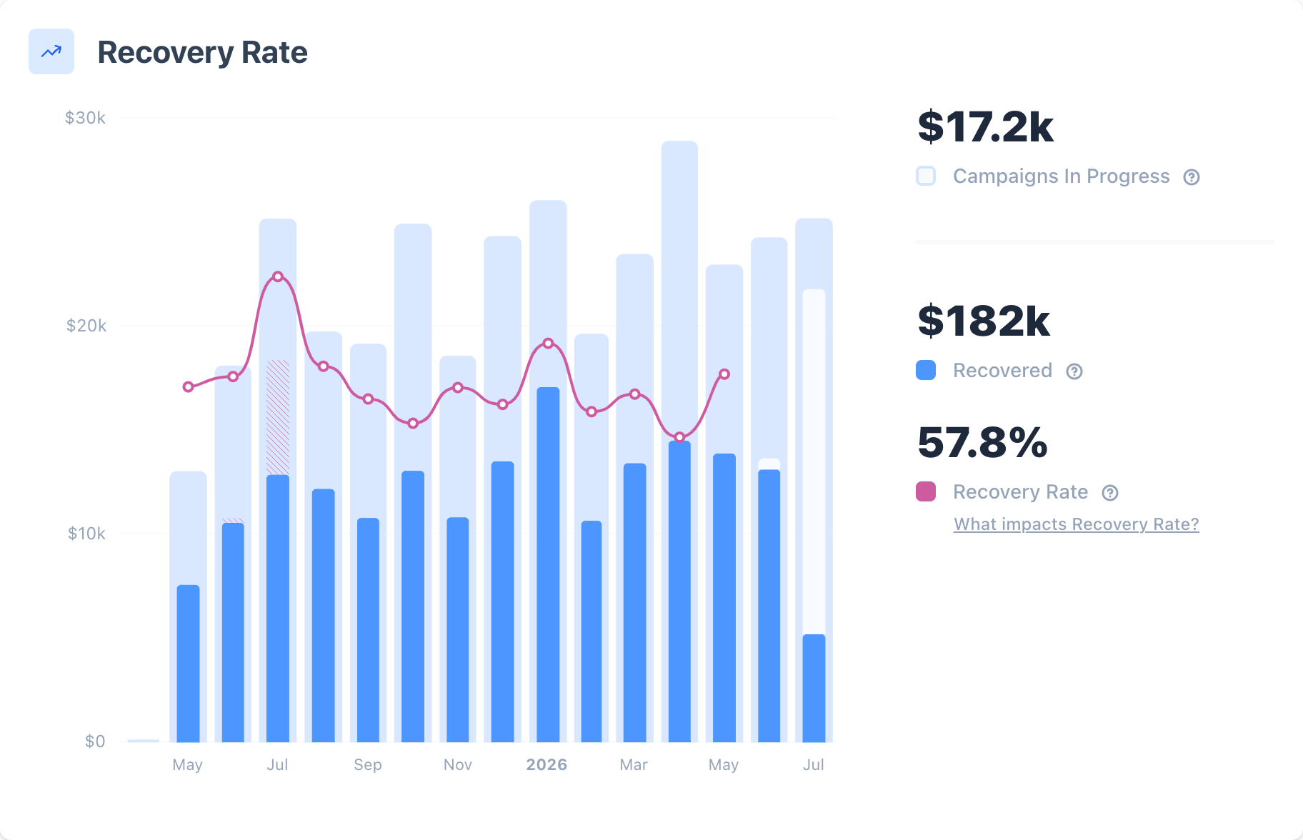
Monthly recovery on your dashboard. We group campaigns by the month they started, so a month keeps filling in until its last campaign resolves.
Recovery Outcomes shows why your rate is what it is
The four-outcome split is the diagnostic chart. Two accounts with the same headline rate can have different problems underneath, and the mix is what tells them apart.
On the loss side, it shows you whether you're losing people who said no or people who never responded. A high share of active cancellations points at the recovery experience itself. A high share of passive churn usually points at reach and window length, so emails that aren't landing or a campaign that closes before late recoveries can happen.
The recovery side splits the same way. Heavy on retries with few card updates suggests customers are not as responsive. Heavy on card updates with few retries suggests the retry schedule could be further optimized. Throughout, the trends will often matter more than individual cohorts, to respond to changes over time. On a platform that doesn't report card updates separately, read this split with the attribution note above in mind.
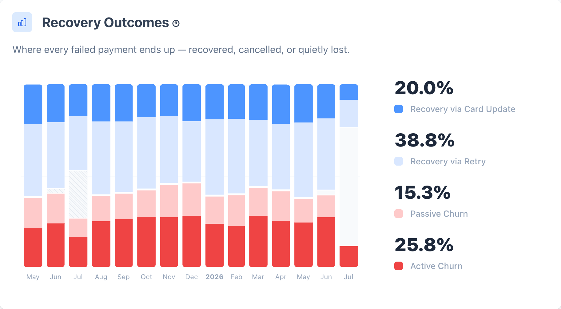
Card updates and successful retries on the recovery side, active cancellations and passive churn on the loss side, charted over time.
Recovery Curve shows which part of the campaign does the work
The curve is your recovery rate accumulating across the window, day by day. A steep early climb means most recoveries land in the first few days. A curve still rising at the end means the window closes before the recoveries stop, and there's revenue sitting past the edge. A curve that flattened days before the end means the window is already long enough.
It's the closest thing in the product to a picture of where you sit against your ceiling. Where the curve goes flat is where more time stops buying you anything.
We build the Recovery Curve on a different basis than the dashboard overview, so its totals won't reconcile with the overview's. Read the curve for its shape, and read the overview for your totals.
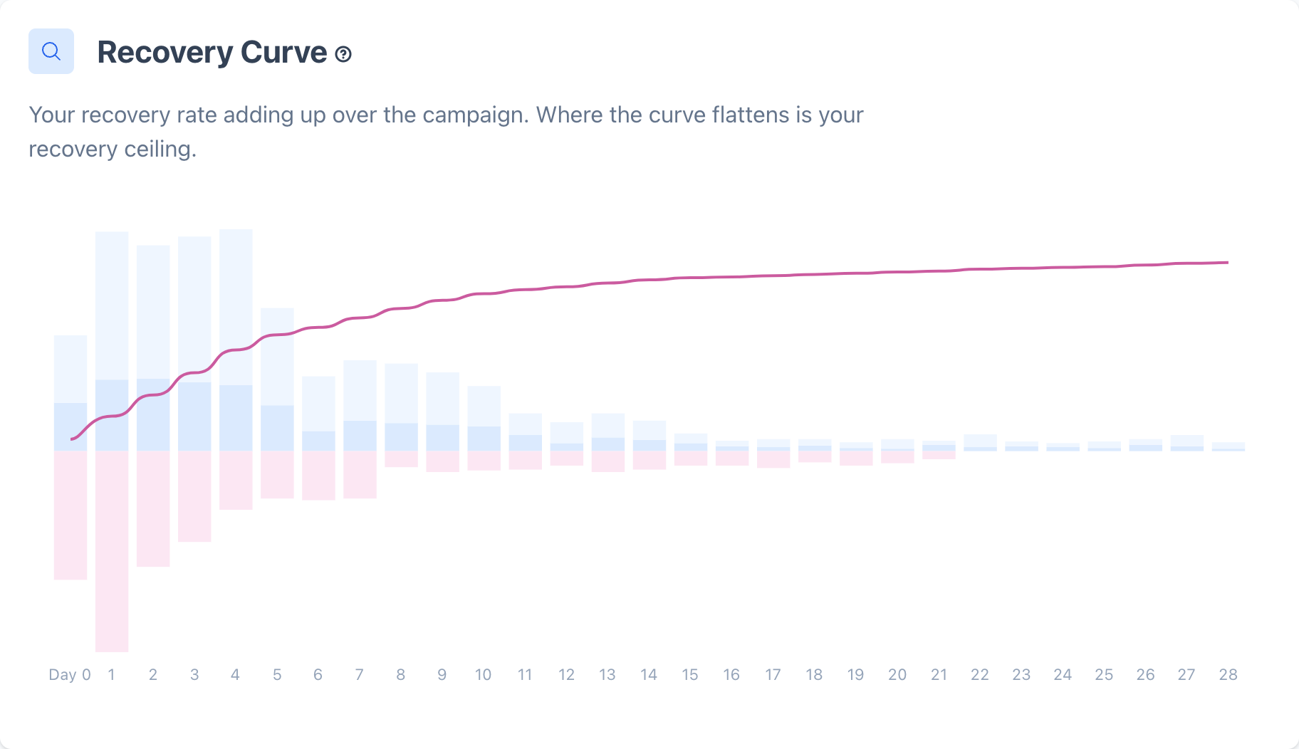
The Recovery Curve shows cumulative recovery across the campaign window, so you can see where recoveries keep climbing and where the line starts to flatten.
How to test a change without fooling yourself
Wait out the transition before you read anything
When you change a campaign, customers who were already mid-campaign finish under the old process. For a stretch afterward your data is a blend of two processes, and neither one is measurable inside it.
A safe rule is to discard at least one full recovery window after the change, then start counting from there. After that, 30 to 60 days of finished cohorts is roughly what it takes for natural variance to average out.
Judge a period against your own variance band, not against your best month
Recovery rates move on their own. With nothing changed at all, an account can swing a wide band between its best and worst rolling window over a few years of history. Sample size, seasonality, price mix, and billing cycles all push the number around.
So before you read a period as a win or a problem, work out the range your account normally operates in. A dip inside that band is natural variance. A move outside it is worth investigating.
Check what else changed before you blame the campaign
Recovery rate sits downstream of plenty of things that have nothing to do with dunning.
- A burst of new subscribers. First-renewal customers fail more and recover less, so a strong acquisition month drags the following month's rate down with no change in process.
- Seasonality. More cards fail in late November and December, and it's harder to get anyone's attention.
- A price or product change, which shifts both who fails and what the failure is worth.
- A processing anomaly, like a batch of vague declines from a temporary issue, or old failures being reprocessed into your funnel.
Segmenting is the fastest way to settle it. Separating first-renewal customers from everyone else usually explains a surprising share of the movement.
A/B testing your dunning campaign
Failed payment volume is the constraint
Marketing teams test against large populations. A dunning test runs against the small fraction of your customers whose payment failed, so a test a marketing team would call in a week can take months here.
The point where the difference between two versions is large enough, across enough cases, that chance is an unlikely explanation. Under-powered tests are the main reason a "winner" reverses a few months later.
Long tests are often inconclusive. The longer a test runs, the more moves underneath it, and cohort change is the biggest mover. The customers you acquired in month three aren't the customers from month one, and that difference can be larger than the effect you're trying to measure.
A good test is early and bold
Isolate it to the first email, where volume is highest because every campaign passes through it. And test a different approach rather than a tweak, so a different framing, a different sender identity, or a different amount of explanation. The point is to learn what kind of approach works on your audience, then apply that further down the campaign where testing isn't practical.
Testing early in a campaign is often the only place with the volume to learn quickly.
A bad test is late and small
Changing three words in a subject line. Rewriting body copy on a fourth email. Neither has the volume or the difference to produce a clean read, and both will spend months not telling you anything.
Downstream tests have to be bolder to be worth running
Later in a campaign the volume drops, so the difference has to be bigger to show up at all. Adding a last chance offer where there wasn't one is a test worth running. Rewording an offer you already send isn't.
Friction moves a transactional email more than copy does
These are transactional emails to existing customers, and the drivers are different from marketing. Gains come from taking friction out and making the message easier to trust, which in practice means fewer steps between the email and a saved card, a sender name the customer recognizes, and a message that says plainly what happened and what to do about it.
Which is why most copy tests aren't worthwhile. The Churn Buster team can advise you on the highest impact tests based on what has worked for other businesses similar to yours.
How we run tests with you
Our team sets tests up and watches them, checking that the two groups are comparable, that volume is accumulating, and that a result is significant before anyone acts on it. We'll also tell you when a test you want to run can't produce a clean answer in a reasonable stretch of time. You can ask our team whether a test makes sense at your volume.
Export your campaign data for your own analysis
Every rate in Churn Buster traces back to a row you can export. Pull your campaign data from Recovery Campaigns, and you can recompute anything the product shows you.
Every export runs in the background. Churn Buster emails a download link to the person who started it, and the link expires in 24 hours.
Exports carry each campaign's full history and its outcome, which is where source attribution lives. Custom export columns add processor-level detail, including the error the processor returned, the error type, the processor name, and how many times the processor had already tried a charge before the campaign started. Our team can add the custom fields you want.
Ask questions about your data with the Churn Buster MCP
The account owner turns on the MCP under Settings → Integrations → MCP. Then each person adds it to their AI assistant. Setup for each app is on Churn Buster MCP.
See how the Churn Buster MCP answers retention questions. It's included on every plan, including the free Measure plan.
Where to go next
This is the last page in the Dunning set, and the pages before it describe one system. Adaptive Campaigns sequences the whole thing, Retries recover payments quietly, Emails and SMS Nudge reach the customers retries can't, Card Updates give them somewhere frictionless to land, Last Chance Offers make a final case, and Alerts pull a person in when one customer is worth it. This page is how you tell whether any of it is working.
For the measurement concepts in more depth, our Learn guides cover Recovery Rate, The 4 Outcomes, Natural Variance, and Rolling Analysis.
Cancel Flows is the other half of retention. Dunning handles customers whose payment failed; Cancel Flows handles the ones who came to leave on purpose.